How to Create Amazon Product Images That Maximise Your Sales
Contents expand_more
You are launching a product on Amazon or trying to improve an underperforming listing, and facing decision paralysis over product images. Amazon’s technical requirements seem strict (white backgrounds, specific dimensions), but you also see competitors with lifestyle images and infographics. You are not sure whether to invest in professional photography or try DIY solutions, and you do not know which images actually drive sales versus which merely satisfy compliance.
Uploading images that violate Amazon’s technical requirements gets your listing rejected, wasting time and potentially delaying your launch. Worse still, using compliant but low-quality images means your listing appears in search results but customers click on competitors. Even if customers click on your listing, inadequate secondary images (missing angles, no context, weak detail) cause them to leave without buying. Every day your images underperform, you lose sales to competitors who understand the psychology of conversion-optimised images.
This guide provides the complete framework for creating Amazon product images that satisfy technical compliance AND maximise conversions. You will learn Amazon’s exact requirements, the psychological principles behind high-converting images, step-by-step creation methods for different budgets, and diagnostic tools to identify and fix image problems that are killing your sales.
Amazon Image Technical Requirements
Amazon’s image requirements exist for two reasons: to maintain a consistent shopping experience across millions of products, and to prevent misleading or fraudulent product presentations. Understanding these requirements prevents rejection delays and ensures your images can actually be seen by customers.
Main Image Requirements (Slot 1):
Your main image appears in search results as a thumbnail. This makes it the primary driver of click-through rate. Amazon enforces strict compliance:
- Pure white background: RGB colour values must be exactly 255, 255, 255. Off-white or light grey backgrounds are rejected.
- Minimum dimensions: 1,000 pixels on the longest side activates Amazon’s zoom functionality. 2,000+ pixels is recommended for optimal detail.
- File format: JPEG is preferred. PNG and TIFF are accepted but JPEG provides better file size optimisation.
- Product coverage: The product must fill 85% or more of the image frame. Small products lost in white space fail mobile thumbnail visibility.
- No text, logos or watermarks: Amazon prohibits any overlaid text on main images to prevent misleading claims.
- No people, props or context: The main image shows only the product. Lifestyle images belong in slots 2-9.
Secondary Image Flexibility (Slots 2-9):
Once main image compliance is satisfied, secondary slots allow creative freedom. Infographic images with overlaid text are permitted. Lifestyle images showing people using the product are permitted. Props and context demonstrating scale or application are acceptable. This flexibility allows you to build perceived value and answer customer questions visually.
Why These Requirements Matter:
The pure white background creates visual consistency in search results where customers compare products side by side. If your background is off-white while competitors use pure white, your thumbnail looks dirty. The minimum pixel requirement ensures customers can zoom in to see detail before buying. Products that do not support zoom have measurably lower conversion rates because customers cannot verify quality. The 85% coverage requirement ensures mobile thumbnails remain recognisable. When your main image appears at 150x150 pixels in mobile search (where 70% of sales occur), a product filling only 60% of the frame becomes an unrecognisable blur.
The Psychology Behind High-Converting Images
One of the most important factors in converting a listing visitor into a sale is the perceived value they hold of the product. Perceived value differs from real value. Real value is the objective quality and functionality of what you are selling. Perceived value is the mental assessment of the product’s worth that customers form based on your listing’s presentation.
Images are the primary driver of perceived value because they affect how customers mentally assess your product’s price. When perceived value exceeds the actual price in the customer’s mind, purchase intent is created. This psychological mechanism explains why investment in professional photography correlates directly with revenue.
How the Mechanism Works:
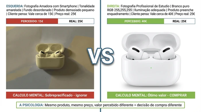
Consider the same product photographed in two different ways. An amateur smartphone photograph with poor lighting, a cluttered background and the product small in the frame creates low perceived value. A customer viewing this image may mentally assess the product as worth around €15. If your actual price is €25, their mental calculation is “overpriced” and they do not buy.
The identical product photographed professionally with studio lighting, a pure white background, proper preparation and the product filling 85% of the frame creates high perceived value. The same customer viewing this professional image may mentally assess the product as worth around €40. Now your €25 price seems a great deal. Their mental calculation is “excellent value” and they buy.
The Effect of the Difference:
The greater the difference between perceived value (what the images make customers think the product is worth) and actual price (what you charge), the stronger the purchase intent. This explains why sellers who invest in professional photography report immediate conversion rate increases even when they change nothing else in their listings.
The same product, same price, but dramatically different perceived value based solely on image quality
Category-Specific Perceived Value Drivers:
Different product categories leverage different visual elements to increase perceived value:
- Clothing: Lifestyle images with models showing fit and style create aspiration. Customers are not just buying the garment, they are buying the lifestyle portrayed.
- Electronics: Clean presentation with proper lighting suggests quality engineering and attention to detail. Cluttered or dark images suggest cheap construction.
- Home goods: Styled room contexts showing products in aspirational settings increase perceived value through association with premium interiors.
- Consumables: Professional photography of food or supplement packaging conveys quality and safety, critical factors in consumable purchase decisions.
The perceived value mechanism is why “good enough” images underperform. Customers make mental assessments in fractions of a second. Your images create that assessment. Professional quality shifts the mental price upwards, making your actual price seem attractive.
Image Types Needed for Maximum Conversions
Amazon provides 9 image slots per listing. The strategic principle is quality over quantity. Use 6-8 slots, with each image serving a distinct purpose. Redundant images dilute impact and increase bounce rate as customers scroll through irrelevant photographs.
Strategic Slot Allocation:
Slot 1 (Main Image): Isolated product on a pure white background. This is your CTR driver in search results and sponsored ads. Optimise for thumbnail recognition at 150x150 pixels. Choose the angle that makes your product most instantly identifiable when small.
Slot 2 (Lifestyle Context): Product shown in use in the real world. This image answers two critical questions: “How big is it?” and “How do I use this?” For clothing, show a model wearing the product to demonstrate fit. For electronics, show the product in use or with size comparison objects. For home goods, show the product styled in a room context. This image builds emotional connection and demonstrates practical application.
Slot 3 (Feature Infographic): Key benefits highlighted with overlaid text. For complex products, create an infographic showing technical specifications. For simple products, use close-ups of quality indicators (materials, texture, craftsmanship) with annotation arrows. This makes features easily perceptible for customers who do not read full descriptions.
Slot 4 (Alternative Angle): A different viewing perspective not visible in the main image. Show the back, side, top view or packaging. This addresses customer uncertainty about what the product looks like from angles they cannot see in slot 1. For products with multiple components, show them separated or assembled.
Slot 5 (Size/Scale Diagram): Dimensional information with measurements. Include comparison with common objects (hand holding the product, smartphone for scale, ruler showing dimensions). This is critical for furniture, clothing, accessories - any category where size confusion drives returns. Clear size information reduces return rates and negative reviews from surprised customers.
Slots 6-7 (Use Case Variety): Multiple application scenarios or before/after comparisons. Show how your product solves different problems or works in different contexts. For versatile products, demonstrate 2-3 use cases. For transformation products (cleaning products, beauty items), show before/after results if Amazon allows.
Slots 8-9 (Optional): Leave empty unless you have genuinely new information to convey. Most effective listings use 6-7 images strategically rather than forcing all 9 slots with redundant content.
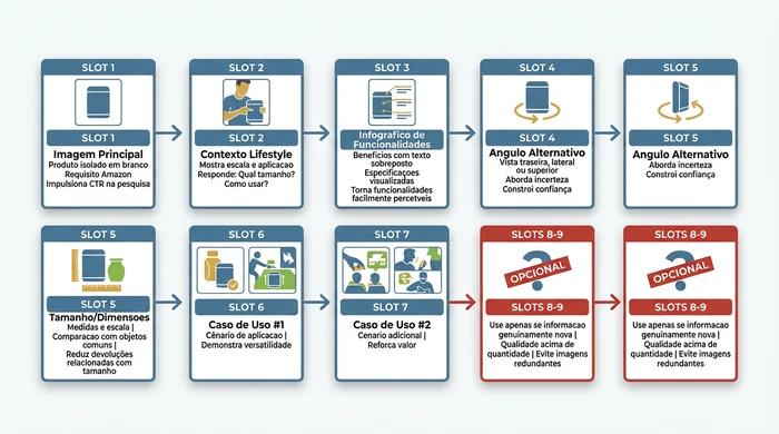
Strategic allocation of Amazon’s 9 image slots - each serving a distinct conversion purpose
Category-Specific Image Strategies
Generic image advice fails because different product categories require different visual approaches.
Clothing Products:
Your main image shows the garment on a white background (mannequin or flat lay). Slot 2 should show a model wearing the product - customers need to see fit, drape and how the garment looks on a human body. Slot 3 shows a close-up of the fabric texture so customers can assess material quality. Slot 5 is your size chart graphic showing measurements. Without this, you will have high return rates from fit problems. Slots 6-7 can show different styling options or the garment in different contexts.
Electronics:
The main image is a clean isolated product with professional lighting suggesting quality engineering. Slot 2 shows size comparison (next to a smartphone, tablet or hand for scale). Electronics frequently look larger or smaller than expected - address this early. Slot 3 is your specifications infographic showing key features with labels. Slot 4 shows ports, buttons or connectivity options that customers need to verify for compatibility. Slot 5 shows packaging contents (which cables and accessories are included).
Home Goods:
The main image is the isolated product. Slot 2 is your styled room context showing the product in an aspirational setting. This not only shows scale, it shows lifestyle. Customers buying home decor are buying the feeling the room creates. Slot 3 shows material or texture close-ups (fabric weave, wood grain, metal finish). Slot 5 is your dimensions diagram, critical for furniture or anything that needs to fit in a space.
Consumables (food, supplements, beauty):
The main image shows the packaging clearly. Slot 2 shows a serving suggestion or application demonstration. For food, show the product plated or in use. For supplements, show the bottle with a size reference. Slot 3 is your nutritional information or ingredients highlights graphic. Customers in these categories care intensely about what is inside. Slot 4 shows the packaging from different angles so customers can read all the label information.
Step by Step: Creating Images with Different Budgets
The right approach depends on your budget, product complexity, level of competition and timeline. There is no single “best” method - there is the best method for your specific situation.
Method 1: DIY Smartphone Photography (Under €50)
Best for: Simple products, low-competition categories, prices under €20, sellers with time but limited budget.
Equipment needed:
- Smartphone with a 12MP+ camera (most phones from the last 5 years qualify)
- White card or white foam board (€2-3 from craft shops)
- Indirect natural window light or 2x existing desk lamps
- Free editing app (Snapseed or Lightroom Mobile)
Process:
Set up near a window providing indirect natural light (not direct sunlight - that creates harsh shadows). Position your white card as the background. Ensure it is truly white, not cream or off-white. Place your product on the background with the product filling most of the frame.
Photograph 20-30 variations. Experiment with different angles (front, 3/4 view, side). Experiment with different distances (ensuring the product always fills 85%+ of the frame). Experiment with different lighting positions (moving your setup to different window angles, or repositioning lamps).
Select your best 6-8 images covering: the main product angle, one lifestyle context (ask a friend or family member to model or use the product), alternative angles and detail shots.
Edit for consistency. Adjust brightness and contrast so the white background appears pure white. Correct white balance if your images have a yellow or blue cast. Crop so the product fills 85% of the frame. Export at a minimum of 2000x2000 pixels.
Compliance check before uploading:
Use an RGB colour picker tool (free online) to verify your background is truly 255, 255, 255. Visually inspect that no text is visible in your main image. Confirm the product fills 85%+ of the frame.
Common DIY mistakes:
- Direct sunlight creating harsh shadows and blown highlights
- Yellow interior lighting creating an orange cast
- Background not pure white (cream or grey shows up in thumbnails)
- Product too small in the frame reducing mobile visibility
- Inconsistent lighting between images making them look unprofessional when viewed together
Method 2: DIY DSLR Photography (€50-200)
Best for: Moderately complex products, medium-competition categories, sellers willing to invest 10-20 hours learning photography basics.
Equipment needed:
- Entry-level DSLR or mirrorless camera (second-hand market: €100-150)
- 50mm lens (often included, or €50 used)
- Roll of continuous white background paper (€10-15)
- Basic three-point lighting kit (€30-50 online)
- Free editing software (GIMP or Darktable)
Learning curve:
Expect to invest 10-20 hours learning camera basics. You need to understand aperture (controls depth of field), ISO (controls light sensitivity and noise), and white balance (ensures colours look accurate). Numerous free YouTube tutorials cover DSLR basics for product photography.
Process:
Set up three-point lighting: key light (main light source at a 45-degree angle), fill light (reduces shadows on the opposite side), and backlight (separates the product from the background). This is the fundamental lighting setup professionals use.
Photograph in RAW format rather than JPEG. RAW files contain more image data allowing greater editing flexibility. You can correct exposure and white balance problems in post-processing that would be impossible with JPEGs.
Edit in batches for consistency. All your images should have the same white balance, brightness and contrast. Inconsistent editing makes your listing look amateur.
This approach produces quality results of 7-8/10 but requires significant time investment. If you are launching multiple products or plan an ongoing Amazon business, the time investment pays off. For a single product launch, professional photography may offer better ROI.
Method 3: Professional Photography (€200-500)
Best for: Complex products, high-competition categories, prices above €50, products requiring styling expertise (clothing, jewellery, food).
Finding photographers:
Search for “Amazon product photographer” or “e-commerce photographer” in your area. Review portfolios looking specifically for product work with white background compliance. Generic portrait or wedding photographers often lack product photography expertise.
Request quotes from 3-5 photographers. Negotiate package pricing (cost per product vs cost per image). Per-product pricing is usually better value if you need 8-12 images per item.
What to provide:
Prepare a brief before the session: competitor examples showing the quality level you want to match or exceed, a detailed shot list (specific angles and contexts you need), brand guidelines if you have them, and a clear description of the product so the photographer understands what they are photographing.
Photoshoot day:
Clean your product thoroughly. Dust, fingerprints and scratches are magnified in professional photography. Be available during the session for questions. If possible, review photographs as they are taken to ensure you are getting the angles and contexts you need.
Expected deliverables:
Request 8-12 fully edited images per product. Specify that you need pure white background files (RGB 255,255,255) for the main image. Ask for web-optimised versions (2000x2000 pixels, compressed for web) and original files for future editing.
Professional photography produces quality results of 9/10. For products in competitive categories or priced above €50, this investment typically pays for itself in increased conversion rate within the first month.
Method 4: AI-Generated Enhancement (Varies)
Best for: Improving existing product photography, creating lifestyle backgrounds, supplementing rather than replacing traditional photography.
When AI Works:
AI tools excel at background removal and replacement. If you photographed your product but the background is not pure white, AI can remove it and replace it with perfect white. AI can generate lifestyle contexts around your photographed product, placing it in room scenes or usage scenarios that would be expensive to photograph traditionally.
When AI Fails:
AI struggles to create photorealistic main product images from scratch. The technology is not yet reliable enough for Amazon’s demanding customers who scrutinise zoom detail. AI-generated images often have subtle artefacts or inconsistencies that undermine trust. For categories where authenticity is critical (food, beauty, supplements), AI-generated product images can trigger scepticism.
Recommended hybrid approach:
Photograph your product professionally or with quality DIY technique. This gives you an authentic, detailed product image. Then use AI tools (Canva’s background remover, Adobe Firefly, Pebblely, Flair AI) to remove backgrounds, generate lifestyle contexts or create infographic elements.
This combines the photorealistic quality customers expect for the product itself with the creative flexibility and cost savings of AI for backgrounds and contexts.
Tools to explore:
- Canva: AI background replacement and removal (subscription ~€13/month)
- Adobe Firefly: Generative fill for extending or modifying backgrounds
- Pebblely: Product-specific AI for creating lifestyle backgrounds
- Flair AI: AI-powered product photography staging
Use AI for secondary image slots (2-9), not for your main image. Amazon customers have high expectations for image quality, and AI artefacts in your main thumbnail will harm click-through rate.
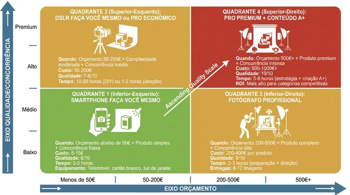
Choose your image creation method based on budget, product complexity and level of competition
Common Image Mistakes That Kill Sales
Weak images manifest as two distinct performance problems: low click-through rate (CTR) and low conversion rate (CVR). Understanding which problem you have determines the fix.
Diagnosis: Low Click-Through Rate Problems
Symptom: Your listing appears in search results (you have impressions) but few customers click through to view details.
Image-related causes:
A low-quality main image is the primary culprit. If your main image is blurry, dark or poorly lit, it loses to competitors in thumbnail comparison. Wrong angle selection means your product is unrecognisable at 150x150 pixel thumbnail size. If the product is too small in the frame (below 85% coverage), it becomes invisible in mobile thumbnails. Your main image must win the thumbnail comparison in fractions of a second against competitors in the same search results.
Also check: The start of the product title (on mobile screens, only the first 60-80 characters appear next to your thumbnail). Price competitiveness. Star rating visibility. These factors work together with your main image to drive CTR.
Image fixes:
Reshoot your main image with professional lighting or better natural light. Test different product angles - what looks artistic at full size may not be clear at thumbnail size. Ensure your product fills 85% or more of the frame. View your main image at 150x150 pixels on a smartphone screen and compare it with thumbnails of top competitors in real search results. If your product is not more recognisable than competitors at that tiny size, you need a different approach.
Diagnosis: Low Conversion Rate Problems
Symptom: Customers click on your listing to view details but do not complete the purchase.
Image-related causes:
A lack of multiple viewing angles prevents customers from fully assessing the product. They can see the front but have questions about the back, sides or top. No lifestyle context means customers cannot visualise the product in use or assess its scale. Missing feature detail (close-ups of quality indicators, materials, construction) leaves questions unanswered. Unclear size and scale creates uncertainty about whether the product suits their needs.
Also check: Bullet point quality (bullet points should work synergistically with images - images show, bullets explain). Review content (negative reviews about aspects not shown in images). Price versus perceived value gap.
Image fixes:
Add 360-degree viewing angles covering front, back, sides, top and bottom where relevant. Include lifestyle images showing the product being used by a person or in a room context. Create size comparison graphics (product next to common objects, dimensional diagrams with measurements, hand holding the product for scale). Add texture and material close-ups showing the quality indicators customers use to assess value.
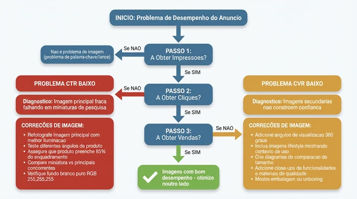
Diagnostic framework connecting image problems to specific performance metrics and fixes
The 6 Most Common Image Mistakes
1. Using all 9 slots with redundant angles:
More images do not equal better results. Three nearly identical product angles from slightly different positions waste slots. Every image must provide genuinely new information. Redundant images increase bounce rate as customers scroll through irrelevant photographs looking for the information they need.
2. Lifestyle-only approach without product detail:
Some sellers overdo lifestyle images showing the product in beautiful contexts but never provide clear isolated product detail photographs. Customers need emotional connection (lifestyle) and rational assessment (detail). A listing with only lifestyle images underperforms because customers cannot assess the product’s real quality.
3. Using generic stock photography:
Customers detect stock photography. If your “lifestyle” image shows a generic model with generic products, it damages trust. If your main image is obviously stock photography of a similar but not identical product, Amazon may remove it and customers will certainly notice. Authenticity matters for building purchase trust.
4. Ignoring mobile viewing optimisation:
Images optimised for desktop viewing frequently fail on mobile where 70% of sales occur. Text in infographic images becomes illegible at mobile sizes. Artistically photographed products look confusing in mobile thumbnails. Test every image on a real smartphone screen at the sizes customers will see them.
5. Weak main image angle selection:
Choosing the most “artistic” angle rather than the most recognisable one. Your main image is not art - it is a thumbnail in a grid of competing thumbnails. Front view or 3/4 view usually works best because customers can instantly identify what the product is. Overhead shots or extreme angles may look impressive at full size but fail at thumbnail size.
6. Skipping A/B testing:
Assuming your first image choice is great without data validation. If you have Amazon Brand Registry, you can A/B test different main images systematically. Without Brand Registry, you can still test sequentially - update your main image, monitor CTR changes for 2-3 weeks, revert if performance declines. Many sellers discover their second or third image choice performs 20-40% better than the first.
Image Creation Decision Tool
Use this decision framework to select your optimal approach based on your specific situation.
| Your Situation | Recommended Method | Estimated Cost | Quality Score | Time Investment |
|---|---|---|---|---|
| Budget under €50 + Simple product + Low competition | Smartphone DIY | €5-15 | 6/10 | 3-5 hours |
| Budget €50-200 + Moderate complexity + Medium competition | DSLR DIY or Budget Pro | €50-150 | 7-8/10 | 10-20 hours (DIY) or 1-2 hours (Pro direction) |
| Budget €200-500 + Complex product + High competition | Professional Photographer | €200-400 per product | 9/10 | 2-3 hours (prep + direction) |
| Budget €500+ + Premium product + Intense competition | Premium Professional + A+ Content | €500-1000+ | 10/10 | 5-8 hours (strategy + direction + A+ creation) |
| Existing photographs need improvement | AI Tools (Canva, Pebblely) | €0-30/month | Varies (7-9/10 for backgrounds) | 2-4 hours learning + application |
Which Images Do I Need? Image Slot Allocation Guide
| Image Slot | Image Type Needed | Purpose and Rationale |
|---|---|---|
| Slot 1 (Main Image) | Isolated product on pure white background (RGB 255,255,255) | Drives CTR in search results. Amazon requirement. No text, logos, people or props. Product fills 85% of the frame. This is your search thumbnail - it must be instantly recognisable. |
| Slot 2 | Lifestyle/In-Context Image | Shows scale and real-world use. Clothing: model wearing the product. Electronics: size comparison or usage scenario. Home goods: styled room context. Answers "How big is it?" and "How do I use this?" |
| Slot 3 | Feature Infographic or Close-up | Highlights key benefits with overlaid text. Complex products: infographic showing specifications. Simple products: close-up of quality indicators (materials, texture, craftsmanship). Makes features easily perceptible. |
| Slot 4 | Alternative Angle or Packaging | Shows perspective not visible in the main image. Back, side, top view or packaging/unboxing. Addresses customer uncertainty about what the product looks like from different angles. |
| Slot 5 | Size/Dimensions Diagram | Reduces returns from size confusion. Dimensional diagram with measurements, comparison with common objects (hand, smartphone) or scale reference. Critical for furniture, clothing, accessories. |
| Slot 6 | Use Case Variation or Comparison | Demonstrates versatility. Multiple application scenarios, before/after comparison or product vs alternatives. Shows the product solves multiple problems or beats competitors. |
| Slot 7 | Additional Use Case or Detail | Reinforces value proposition. Another usage scenario, warranty visual or material/texture close-up. Use only if it genuinely adds new information. |
| Slots 8-9 | Optional - Leave Empty Unless Essential | Quality over quantity. Use only if the images add genuinely new information. Redundant images dilute impact and increase bounce rate when customers scroll through irrelevant photographs. Most effective listings use 6-7 slots strategically. |
Mobile Optimisation Strategies
70% of Amazon purchases occur on mobile devices, yet most sellers optimise images for desktop viewing. This creates a fundamental disconnect between how you test your images and how most customers actually see them.
The Mobile Reality:
Your main image appears as a 150x150 pixel thumbnail in mobile search results. Product detail page images appear smaller on mobile screens. Text in infographic images must remain legible at mobile sizes. The mobile swiping interface means most users do not scroll beyond the first 4 images unless the initial images compel them to continue.
Thumbnail Visibility Test:
Before finalising your main image, export it at 150x150 pixels. View this tiny version on your smartphone. Ask yourself honestly: “Can I instantly identify what this product is?” If you hesitate even for a second, your main image fails mobile optimisation. Reshoot with the product filling more of the frame, choose a simpler angle, or increase the contrast between product and background.
Infographic Text Legibility:
If you are creating infographic images with overlaid text (permitted in slots 2-9), use a minimum font size of 18-20 points. Test legibility on a real smartphone screen. Text that is perfectly legible on desktop frequently becomes an illegible blur on mobile. Avoid text-heavy designs - use large, bold annotations with minimal words.
Swipe-Friendly Image Order:
Mobile users swipe through images horizontally. Place your most important images in slots 1-4 because many users do not swipe beyond the fourth image. The critical sequence is: main product (slot 1), lifestyle context (slot 2), key features or infographic (slot 3), alternative angle or size reference (slot 4). If users see only these four images, they should have enough information to make a purchase decision.
Page Load Speed Consideration:
Image file size affects mobile page load time, especially for customers on cellular data. Amazon’s mobile app is optimised, but unnecessarily large files still cause delays. Compress your images without quality loss using tools like TinyPNG or ImageOptim. Balance quality against file size. A 2000x2000 pixel image should not exceed 200-300KB after compression.
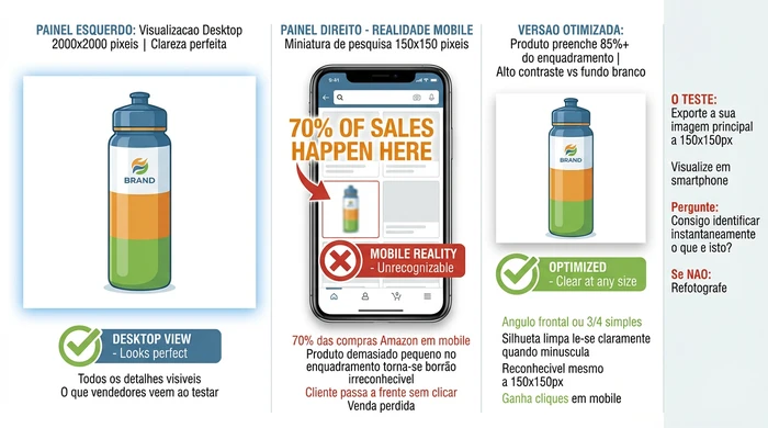
Test your main image at 150x150 pixels on a smartphone screen before uploading - this is how 70% of customers see your product for the first time
Post-Launch Testing and Optimisation
Image optimisation is not a one-off task. Markets evolve, competitors improve their images, and customer preferences change. Systematic testing identifies improvement opportunities.
A/B Testing for Brand Registry Users
If you have Amazon Brand Registry, you can access Amazon’s A/B testing functionality (called “Manage Your Experiments”). This enables systematic testing of main image variations.
Test variables worth exploring:
Product angle: Does front view beat 3/4 view? Does your product look better slightly rotated? Lighting style: Does bright white studio lighting beat slightly warmed lighting? Product staging: For products where props are permitted in the main image (though generally prohibited), does clean isolated product beat minimal staging? Colour emphasis: For products available in multiple colours, which colour variation drives the highest CTR as the main image?
Success metrics:
Increased click-through rate indicates better thumbnail appeal. If your new main image gets 15% more clicks from the same number of impressions, you are winning the thumbnail comparison in search results. Increased conversion rate indicates better detail page persuasion. Sometimes an image that gets slightly fewer clicks actually converts better because it sets accurate expectations.
Testing timeline:
Run tests for a minimum of 2-4 weeks to achieve statistical significance. Longer in categories with seasonal fluctuations. Do not conclude after 2 days of data - you need sufficient sample size to know whether differences are real or random variation.
Manual Optimisation for Sellers Without Brand Registry
Without Amazon’s built-in A/B testing, you can still test sequentially.
Process:
Update your main image to a new variation. Note the exact date. Monitor your traffic and conversion metrics for 2-3 weeks in Amazon Business Reports. Compare performance against the 2-3 weeks before the change. If CTR or conversion rate improved, keep the new image. If performance declined, revert to the original.
This approach is less scientifically rigorous than simultaneous A/B testing (external factors like seasonality or competitor changes can affect results), but it is better than assuming your first choice is great.
Competitor monitoring:
Capture screenshots of top competitors’ images quarterly. Identify emerging trends in your category. If competitors start using lifestyle images more heavily, test whether adding lifestyle content improves your performance. If the category shifts towards infographic-heavy approaches, test whether feature highlights resonate with your audience.
Customer feedback mining:
Read your product reviews looking for image-related comments. “Wish I could see the back” means you need an alternative angle. “Didn’t realise how small it was” means your size reference is inadequate. “The colour looks different from the photo” means your white balance is incorrect. Customer complaints are free feedback about image gaps.
Seasonal updates:
Update lifestyle images for festive season contexts. A product shown in Q4 with festive decorations or gift-giving scenarios can outperform generic lifestyle images. Add seasonal use cases (showing a product used at the beach in summer, or indoors during winter). Update for style trends annually - lifestyle images from 5 years ago look dated and reduce perceived value.
Variations and Exceptions
Standard image optimisation guidance applies to most sellers, but several scenarios require modified approaches.
If you sell on multiple Amazon marketplaces:
Amazon’s image technical requirements (white background, pixel dimensions, 85% coverage) are consistent globally. However, the cultural context for lifestyle images varies significantly. A lifestyle image showing the product in a typical American home may not resonate with Japanese customers. Model ethnicity, room style and usage contexts should reflect the local market you are targeting. If you sell in the US, UK and Germany, consider creating market-specific lifestyle images for slots 2-9 while keeping the same compliant main image across all marketplaces.
If your product has multiple colour or size variations:
Your parent listing shows all variations, but each child ASIN can have unique images showing that specific variant. Your main image should clearly differentiate variants - a photograph of the red product for the red version, blue for blue. Do not use the same main image across all colour variations forcing customers to read small text to know which they are buying. Size variations benefit from comparison images showing the different sizes together so customers can visualise the differences.
If your category has specific image restrictions:
Jewellery and watches have specific category requirements often requiring or prohibiting model-worn photographs. Clothing has guidelines around appropriate model presentation. Check Amazon Seller Central’s category-specific image guidelines before photographing. What is permitted for electronics may be prohibited for supplements or restricted categories.
If you use Amazon Virtual Product Bundles:
Bundle main images must show all included items. If you are bundling three products together, your main image needs all three products visible. Individual product images from the standalone listings may not accurately represent what customers receive. Create custom bundle photography showing everything included.
If you have Brand Registry and A+ Content access:
A+ Content appears below your standard listing and allows up to 16 additional images in different formats. These use different dimensions (970 pixels wide recommended) and different purposes (deeper storytelling, brand building, detailed comparison charts). A+ Content images complement your 9 main listing images rather than duplicating them. Use A+ Content for brand story, detailed how-to guides, comparison tables and extended lifestyle photography that would be excessive in the main listing.
For guidance on optimising other listing elements such as bullet points and product titles, these work synergistically with images to drive conversions.
Frequently Asked Questions
Q: What are Amazon’s main image requirements for product listings?
Amazon requires main images (Slot 1) to have a pure white background with RGB colour values of 255, 255, 255, a minimum of 1,000 pixels on the longest side (2,000+ recommended), the product filling 85% or more of the frame, JPEG as the preferred file format, and no text, logos, watermarks or visible people. Secondary images (Slots 2-9) can include infographics, lifestyle contexts and overlaid text.
Q: How many images should I use for my Amazon product listing?
Use 6-8 of Amazon’s 9 available image slots strategically. Each image should serve a distinct purpose: main product image (Slot 1), lifestyle context (Slot 2), feature infographic (Slot 3), alternative angle (Slot 4), size diagram (Slot 5) and use case variety (Slots 6-7). Do not use all 9 slots with redundant images as this dilutes impact and increases customer bounce rate.
Q: Do lifestyle images increase sales on Amazon?
Yes, lifestyle images showing the product in use increase conversions when they help customers understand the product’s scale, usage context or benefits. However, balance is critical. Listings without isolated product detail images (close-ups, multiple angles) underperform because customers cannot assess real quality. Aim for 40% lifestyle context and 60% product detail for most categories.
Q: Can I use AI to create Amazon product images?
AI tools work best for improving existing product photography (background replacement, lifestyle context generation, infographic elements) rather than creating main product images from scratch. The hybrid approach is most effective: photograph the product professionally, then use AI (Canva, Adobe Firefly, Pebblely) to generate lifestyle backgrounds and contexts. Main product images created entirely by AI often lack the photorealistic detail Amazon customers expect.
Q: What size should Amazon product images be?
A minimum of 1,000 pixels on the longest side is mandatory, but 2,000+ pixels is strongly recommended to activate Amazon’s zoom functionality, which is a proven conversion driver. Larger images (up to 10,000 pixels) are accepted and provide even better zoom detail, but file size must be balanced against mobile page load speed (compress without quality loss).
Q: How do I know if my images are hurting sales?
Use a diagnostic approach. Low click-through rate (CTR) despite impressions indicates a main image problem (weak thumbnail appeal in search results). Low conversion rate (CVR) despite clicks indicates secondary image problems (missing angles, missing lifestyle context, unclear detail). Use Amazon Business Reports to track these metrics in your Seller Central account, then address image problems accordingly.
Q: Is professional photography worth the cost for Amazon listings?
The decision depends on product complexity, level of competition and price. Professional photography (€200-500) is worthwhile when product complexity requires styling expertise, competition is high (you need differentiation), or the price is above €50 (the investment is a small percentage of potential revenue). Simple products in low-competition niches priced under €20 can perform well with quality smartphone DIY photography.
Conclusion
Amazon product images serve dual purposes: technical compliance (getting your listing approved and visible) and conversion optimisation (turning views into sales). The perceived value mechanism explains why image quality investment correlates directly with revenue. Professional images increase buyers’ mental assessment of your product, making your price seem attractive and creating purchase intent.
Start with compliance to avoid rejection delays. Ensure your main image has a pure white RGB 255,255,255 background, a minimum of 2,000 pixels on the longest side, and your product filling 85% of the frame. Then invest in quality based on your budget level. DIY smartphone photography works for simple products in low-competition categories. Professional photography is justified for complex products, competitive categories or prices above €50. Finally, optimise through testing. A/B test main image variations if you have Brand Registry, or monitor performance after sequential changes.
Images work synergistically with bullet points and product titles. While images drive perceived value and provide visual proof, bullet points address emotional motivations and logical justifications. For sellers looking to optimise bullet points using similar psychology-first principles to the perceived value concept discussed here, tools like WhyBuyIt analyse customer emotional triggers before generating copy.
Audit your current product images using the diagnostic framework (CTR and CVR analysis in your Amazon Seller Central reports). Identify your budget level and product complexity level. Follow the checklist for the appropriate creation method from this guide. Remember that image optimisation is not a one-off task. Plan seasonal updates, competitor monitoring and ongoing testing to maintain your conversion advantage. Sellers who treat images as strategic assets rather than compliance checklists consistently outperform those who upload whatever photographs they have available.